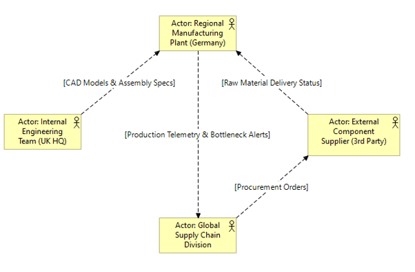
What it shows:
A visual representation of the key business units, geographic locations, and external partners, highlighting the lines of collaboration and data sharing between them. Unlike a strict HR hierarchy, this shows the organization as a “network” of interacting nodes (e.g., highlighting that an internal engineering team must collaborate with an external manufacturing supplier).
Why it’s needed:
Operating model context and data residency boundaries. This proves to InfoSec and Governance teams exactly where the system users physically sit. If a platform is going to be accessed by external supply chain partners or international vendors, this map flags those geographical and collaborative boundaries immediately.
When to use it:
Highly recommended for SADs when deploying federated systems, multi-national platforms, or any solution that brings external third parties (like supply chain vendors or contractors) into the internal environment.
When NOT to use it:
Generally best to omit for localized deployments or standard COTS rollouts where the organizational boundaries and locations are already established and unchanging. If deploying a platform for a single team in a single building, or doing pure backend infrastructure work, drawing this map is a waste of time.
Example: