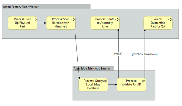
What it shows:
A sequential, step-by-step visual representation of a specific business operation or user journey. Using swim lanes, it maps out the exact sequence of events, decision gates (e.g., authentication success/failure), and hand-offs between human actors and the underlying systems.
Why it’s needed:
Operational clarity and integration mapping. This proves to the business that the software will function efficiently in the real world. It ensures the technical architecture accounts for the daily workflows of the end-user. If a workflow involves too many manual steps or illogical jumps between systems, this diagram exposes those bottlenecks before a single line of code is written or software is configured.
When to use it:
Highly recommended for SADs and HLDs when implementing new workflows, integrating multiple platforms, or defining critical user journeys (like Single Sign-On authentication flows, operational baseline approvals, or data ingestion pipelines). It is essential whenever the solution dictates a specific operational sequence.
When NOT to use it:
Generally best to omit for static, backend infrastructure deployments where there is no human workflow or operational process change (e.g., deploying passive storage arrays, core network switches, or replacing server hardware). If the deployment is entirely transparent to the end-user’s daily sequence of tasks, a process flow adds unnecessary bloat.
Example: