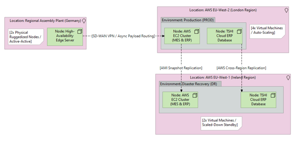
What it shows:
A map of the physical data centres (e.g., DC1, DC2), the underlying hardware/hypervisor platforms, and how logical environments (Production, Staging, DR) are distributed across them. It explicitly lists the VM counts and replication mechanisms. Unlike the Phase 3 Application diagram, which factors in users, this focuses entirely on where the physical servers sit and how the data centres replicate to survive a disaster.
Why it’s needed:
Hardware procurement strategy and Disaster Recovery (DR) validation. This diagram visually maps the infrastructure resilience, proving to business continuity teams that if the Primary Data Centre is destroyed, systems are safely replicated to a geographically separate site. Note: This diagram is designed to be paired with the Resource Sizing Table (BoM) to dictate the exact physical compute specifications.
When to use it:
Highly recommended for SADs and Low-Level Designs (LLD) on physical on-premises deployments, hybrid-cloud setups, or multi-region cloud architectures. It is essential whenever high availability (HA), disaster recovery, or strict physical segregation of Production and Non-Production environments is required.
When NOT to use it:
Generally best to omit for true Software-as-a-Service (SaaS) deployments (where the vendor entirely manages the data centres) or simple, single-server sandbox environments where disaster recovery and hardware segregation are not in scope.
Example: