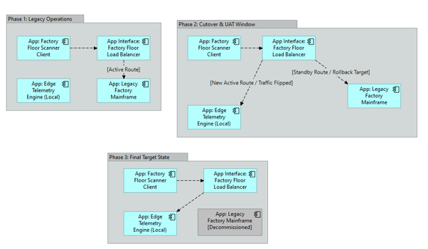
What it shows:
A visual timeline of how legacy applications are retired and replaced, showing how user traffic, DNS routing, and load balancers shift from the old system to the new one. The Data Migration Diagram shows how files are extracted behind the scenes; the Application Migration Diagram shows how user access moves to the new system.
Why it’s needed:
Cutover strategy and user routing. This diagram acts as the flight plan for the IT networking and helpdesk teams. It shows exactly when the load balancers need to be flipped to point users to the new system and proves that a safe rollback plan exists if the new application fails during the cutover window.
When to use it:
Highly recommended for SADs and HLDs when performing complex “Side-by-Side” COTS upgrades, moving on-premises applications to the cloud, or using a phased “Strangler” migration pattern where modules of a legacy system are replaced one by one over several months.
When NOT to use it:
Generally best to omit for Greenfield deployments (where no legacy app exists) or where a big bang cutover is being used. It can also be skipped if the migration is purely a backend data transfer and the actual application servers the users interact with remain completely unchanged.
Example: